DATE
FEBRUARY - MARCH 2026
Handy Signs
For HandySigns, I contributed to the marketing strategy and designed the complete B2B/B2C e-commerce user flow, creating a seamless experience from discovery to purchase. I've also designed the Play Store graphics to present the mobile app.
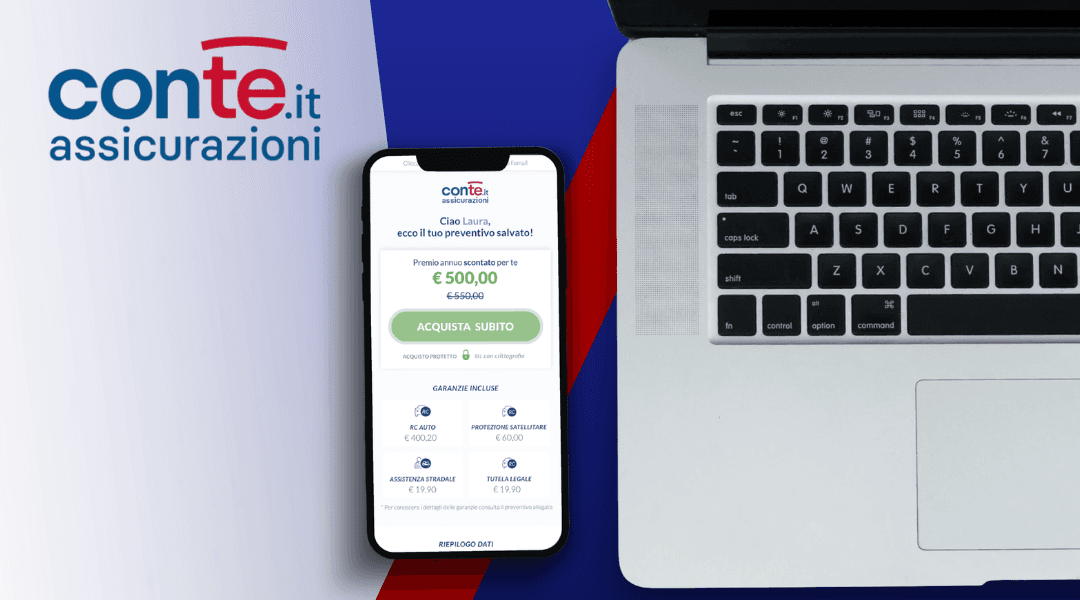
I designed Handy Signs’ e-commerce experience from the ground up, creating two parallel flows:
Companies: can purchase a business plan or request a custom offer via a form. The checkout process includes account creation.
Private users: can register for a free plan to get 10 minutes of app usage. They can create an account and top up credit to continue using the service.
E-Commerce
Startup
Services
Marketing Strategy + UX UI Design
Category
E-Commerce | Startup | App
Client
Handy Signs


Analysis | Market Analysis & Offer Structure
I analyzed the competitive landscape and target audience to identify opportunities in the B2C segment. This phase focused on positioning the product, structuring the offer, and defining the key elements needed to communicate value effectively to potential customers.
Defining the Value Proposition
Based on research insights, I defined a clear value proposition that highlights the product’s benefits and differentiates it within the market. This phase focused on aligning the offer with the real needs of the target audience, identifying the most compelling features, and shaping a message that communicates value in a simple and immediate way. The goal was to create a strong foundation for both the marketing strategy and the user experience, ensuring consistency across the entire customer journey.


Challenges & Solutions | The UX Flow
During the design process, several usability and communication challenges emerged, particularly in presenting the product clearly and guiding users through the purchasing journey. These issues were addressed through targeted UX solutions aimed at simplifying the experience and supporting user decision-making.
Identifying friction points and designing effective responses.
A deeper analysis revealed friction points in navigation, information hierarchy, and product comprehension, which could potentially slow down the purchasing process. To address these issues, I restructured key interface elements, clarified the most important product information, and streamlined the user flow across the e-commerce journey. Each solution was designed to reduce cognitive load, improve clarity, and create a smoother path from product discovery to checkout, ultimately supporting a more confident and efficient user experience.

Design | Imagining the whole experience
Blending strategy, UX, and visual storytelling to craft a seamless customer journey.
From insight to experience
Clear communication and efficient deployment are essential to the success of any project. We maintain open lines of communication throughout the entire process, ensuring your goals and expectations are met. Our team actively listens and collaborates with you to refine details and offer guidance. When it’s time to deploy, we ensure a smooth transition, handling all technical aspects to guarantee a flawless launch.